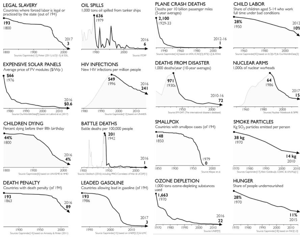
Charts are from 2018.

  • DarkNightoftheSoul@mander.xyz
    link
    fedilink
    English
    arrow-up
    20
    ·
    edit-2
    2 months ago

    Legal slavery… Hey, I wonder if we’re including America in this list? What with the whole “except as a punishment for crime” clause that was conspicuously not covered in my high school education. Shame we don’t have access to the information they used to structure the graph.

    Oil spills… Hey, wasn’t there an enormous oil spill in 2010 that dumped about as much crude as all the rest of the sources on this graph combined? Strange that isn’t listed- Oh, I see. We’re only talking about boats, and the front doesn’t fall off of those anymore. But wait, it lists a 636kt spill in 1979- the ixtoc spill which before bp was the largest spill in history. Strange. Very strange.

    Plane crash deaths… Hey, wasn’t there no civilian aviation regulations in 1929? No strict standards for training and construction? It’s pretty good we started regulating that, yep. Kinda seems strange to compare a time when any drunk cowboy could hop in a wooden-and-paper biplane to a time when even when the door blows out and the cabin loses pressure at altitude nobody dies.

    Child labor… I guess I can’t fault the author for not predicting the future from 2018. Does seem kinda strange conditions for the graph though. both full time and “bad conditions?” I would personally have considered a child between 5-14 working full-time instead of going to school to be in bad conditions, but hey maybe thats just me.

    Solar prices… Yep, you got me on this one. Like most other commercial technologies, solar panels have tended to get cheaper since their inception. You got me, this is unironically good.

    HIV infections… They should never have been as high as this in the first place, fuck-you-very-much reagan, you evil bastard, I’m disappointed there’s no hell for you to burn in, but yeah its nice that we have better understanding as a community, and better medical treatments.

    Disasters… yeah it turns out that actively planning for disasters is a way better idea than the mostly just “god wills it because sin” thing we did in the past. Whoda thunkit.

    nuclear… 15,000 nuclear arms are still an apocalyptic lot. This is the older, smaller ones, that we know about.

    I think I’ve had enough nauseatingly false optimism for one day.

    Edit: Deepity, noun: (1) A statement that appears profound but only because it is actually logically ill-formed. (2) A statement that, to the extent which it is true is trivial, and to the extent which it is not trivial is not true.

      • WarlockLawyer@lemmy.world
        link
        fedilink
        arrow-up
        11
        ·
        2 months ago

        There is a difference between being optimistic and using misleading graphs to make things appear better than they are.

    • Kentaree@lemmy.world
      link
      fedilink
      arrow-up
      14
      ·
      2 months ago

      Your criticism of the plane crash statistics are dumb. You’re basically complaining that falling numbers because of actual actions on problems don’t count because… Reasons? You can be cynical while recognising that progress is indeed happening

      • LeafOnTheWind@lemmy.world
        link
        fedilink
        English
        arrow-up
        2
        ·
        2 months ago

        His argument is bad, but that graph is too. It should have started at a later year for a better comparison.

      • DarkNightoftheSoul@mander.xyz
        link
        fedilink
        English
        arrow-up
        1
        ·
        edit-2
        2 months ago

        I’m not saying the numbers don’t count. I’m saying they’re both trivial and misleading. In 1929 51 people died in aircrashes. In 1979 271 people died in a single crash. 1929 is a huge spike on the graph. 1979 isn’t even a blip. It’s a badly constructed graph. You’d get points off for this if presented as the answer to a question in a stats class. Also, is it showing, I assume (since we don’t have access to data on how the graph was constructed) the data for America, but in other graphs it shows global stats. Why did the author pick America and not global? Were the data not available for other countries? Did the data not tell the story the author wished for? We can’t tell. Why is this graph a 5-year average- none of the other graphs are. Does it tend to hide irregularities that would bias the reader against conclusions the author wished the audience to reach, or is there a totally benign, reasonable explanation I’m not thinking of? We don’t have access to the data they used. We can’t tell.

        Am I a cynic? Yeah, I suppose when I find hopium goes down bitter, yes I am. It’s not a matter of “everything needs to be perfect or it doesn’t count” or somesuch, as another commenter suggested, but rather a matter of “this is totally irrelevant in the face of a looming apocalypse.” Where are our regulations for the climate? Where is our “airplane construction”, our “pilot training”? It’s a case of “Don’t look at the bad numbers, look at these happy numbers instead!” Gag me with a fucking spoon, and then let’s pass some fucking legislation or burn something important until people are willing to listen.

        Again, not saying the numbers are false, but trivial, misleading, and irregular. The picture it paints is a deepity.

  • GBU_28@lemm.ee
    link
    fedilink
    English
    arrow-up
    12
    ·
    2 months ago

    ITT: folks try to find an edge case to invalidate the graph of their greatest dislike/concern.

    There are some good topics of progress on earth. There are many bad. There are many injustices and side cases that these graphs don’t display. Folks online sometimes cannot ever see anything but doom.

  • grue@lemmy.world
    link
    fedilink
    English
    arrow-up
    3
    ·
    2 months ago

    I wonder if the “legal slavery” countries and the “leaded gasoline” countries are the same three?