
You must log in or register to comment.
I realize it could be a lot harder to organize but I’d be interested in a version of this where the size of the country corresponds to the number of countries it touches. In this version seems like we get some weird shapes/sizes just to fit everything into a circle.
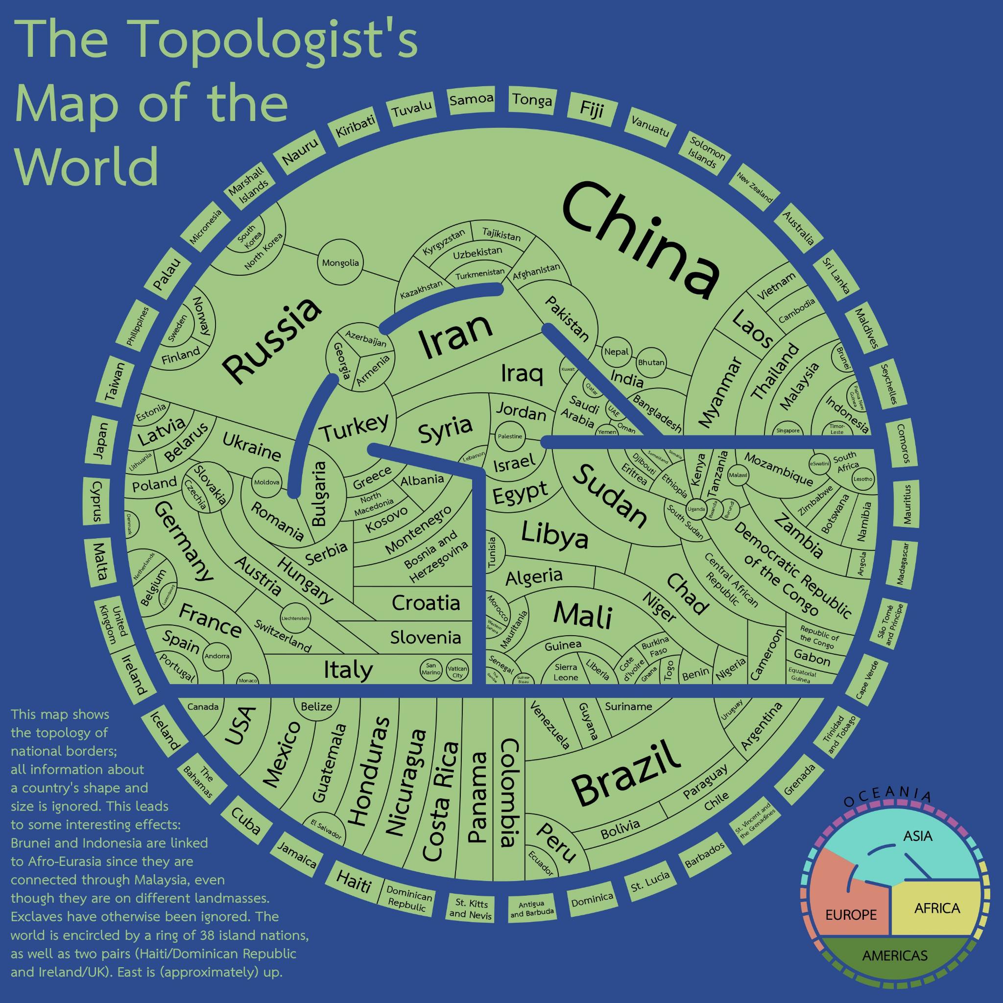
There are several seas here: Red, Mediterranean, Black and Caspian. The Arctic and Antarctic Oceans are not represented, that’ll minimize the perimeters of Canada and Russia.
Overall, this is a very intriguing visualization of the political world. Fascinating stuff. Which I’m not sure I fully understand, don’t get what “topology” refers to, but to me it evokes an image highlighting different altitudes, as with mountains, valleys and coastlines.
If altitude is portrayed I don’t see it. I think this map is purely to show borders/adjacency without consideration of size and only vague consideration of location. Size kinda sorta correlates with the number of adjacent countries but also seems a bit arbitrary.
This is wrong, argentina also borders bolivia and Paraguay doesn’t border chile
also Brazil borders France
This could actually be really handy if you want to do a road trip and spend as much time in customs as humanly possible.
I wonder what it would look like with embassies included
I don’t get the bit about Brunei and Indonesia being linked to afro-eurasia
Malaysia has a part on the mainland and also on an island (which it shares with Brunei and Indonesia I believe)
Oh is it they should be on the outskirts of the map otherwise, as they’re oceanic?
being linked to afro-eurasia
Why not? Kalimantan is part of (South East) Asia.
This is like the UK Metro map of the world.
Now do one of Middle Ages Europe
The biggest land border France has is with Brazil.
