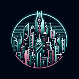
Last week, I tried describing what I was thinking for a new logo for this community. Here’s my attempt at showing what I was thinking. Yes, it’s very amateurish and I would love for someone to make it better, but it shows my intent. Also, I think it’s somewhat recognizable when shrunk down:

I’m still open to the idea of others creating a new icon, but if I don’t get anything else I might use my mod powers to declare that by unanimous consent everyone agrees my half-assed icon is the best.


I like it dude. What’s funny is like when you made that first post about your icon I was trying to make it with a mohawk LOL but all the AI apps I had weren’t doing it right so I just got fed up with it I really like this definitely